THE COLOR-MANAGEMENT CHAIN
Adobe Photoshop Epson ColorSync Work Flow
Print Matches Monitor Tutorial
by ©2002 www.gballard.net
COMPLETELY REVISED March 2012 -- refreshed May 2026
2026: WOW TIME FLIES -- this is talking Lion as the current macOS -- I'm leaving it up as the theory still holds water

This professional printing workflow tutorial is to jump-start the Adobe Photoshop, Epson, ColorSync, color management BASICS in my lay style for lay Mac users (like me). A how to make the print match screen monitor match print tutorial through Adobe Photoshop Color Management workflow.
Professional Epson Photo series ink-jet printers are the recommended printers.
|
MAIN POINT OF THIS ARTICLE:
Color Management is a chain -- like all chains -- it is only as strong as its weakest link.
At the end of the chain:
The printed print will match the 'calibrated' monitor -- or -- we missed something.
Finding that "something" should be no more difficult than reviewing the chain for its weak link....
|
The Color Management Chain:
|
|
|
| TERMINOLOGY: |
CMS = Color Management System
PSD = Photoshop Creative Suite CS6 CS5 CS4...(PS 5.5 and earlier not supported)
Good Screen = an accurate, "hardware profiled" monitor
Good File = a known good image like the PDI reference targets, for example
Good Profile = an accurate ICC profile for the SPECIFIC monitor or target printer/paper/ink or device |
| 1) Get a Good Screen: |
I most highly recommend investing in a hardware monitor profiling package, a "puck" (colorimeter) that reads the screen with software to build accurate custom monitor profiles.
Here is a tutorial with tips about how to HARDWARE CALIBRATING monitors, including links to recommended top professional profiling packages like the Xrite and Spyder manufacturers.
FELLOW DIE-HARD MAC USERS: Forget calibrating your monitors to 1.8 gamma... even Apple is recommending 2.2 monitor gamma -- here is more information about Apple's switch to 2.2 monitor gamma under Snow Leopard 10.6, and 10.7 Lion's switch to sRGB as its System default color.
Here is a great monitor test web page I prepared to demonstrate why 2.2 gamma is recommended. It is designed to PROOF the shifty nature of 1.8 & 2.2 gammas, the AdobeRGB, sRGB, ProPhotoRGB and AppleRGB ColorSpaces through color-managed Web browsers.
|
If you are stuck with "eyeball" monitor 'calibrating' software:
Apple's Displays> Color: Calibrate... or Windows' Display Color Calibration routines or SuperCal™ can profile pretty good monitor profiles (with practice and some talent), but it is no replacement for hardware calibration — a puck that reads the actual screen.
TIPS using an "eyeball" calibrator:
In the past, these types of software calibraters seemed prone to build off whatever profile was enabled — i.e., if that profile was defective — it would build another defective profile. To get around this, always FIRST load a fresh OEM or sRGB monitor profile before starting the process.
It may take several tries to get an acceptable profile built so always start over by highlighting a new fresh OEM or sRGB profile.
MAC OSX procedure:
Start by opening OS-X System Preferences> Displays> Color> Display Profile -- then click on sRGB, or preferably, the monitor's OEM profile -- because starting Calibrator with a defective profile loaded will only build another bad profile.
Profile monitor to 2.2 gamma, D65/6500K.
Complete process and save the new profile with date (so you can tell how old the profile is). Experts recommend profiling monitors at least one a month.
Note:
As a last resort, if you still cannot calibrate a good profile, try doing a hardware Reset on the monitor to restore factory defaults.
Then use the Apple Monitors/Displays> Color> Calibrator to build the new monitor profile (highlight sRGB before clicking on the Calibrator).
If the custom profile is still bad, review my COLOR LOOKS BAD article to learn about how to rule out defective monitor profile, including simple tests.
|
|
Color only looks bad in Adobe Photoshop
and color-managed applications:
|
| For more info about color-managed applications like Photoshop and Safari displaying differently than unmanaged applications, please review my: Color Only Looks Bad in Photoshop white paper. |
| 2) Setup Photoshop ColorManagement: |
Recommended Photoshop Color Management Policies Settings:
For brevity, I will recommend these Photoshop Color Settings in both Mac and WIndows PC workstations because they are the safest settings.
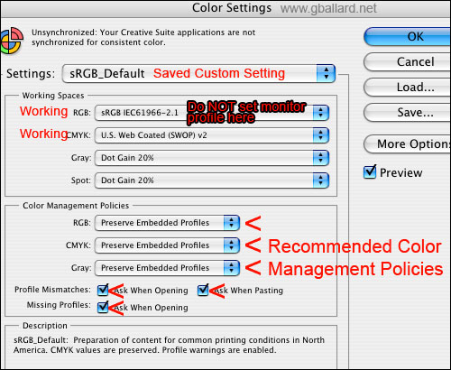
- Photoshop, go to Edit> Color Settings> Settings
- Set Settings to "North American Prepress 2" (to reset them)
- Then change Working Spaces> RGB to sRGB, and Working Spaces> CMYK to whatever you use. I used sRGB because it is the safest color space to work in.
- Then Save the Color Settings with a custom name so you can easily see if they are changed, below I named my custom set "sRGB_Default."
IMPORTANT: Leave all Color Management Policies set to "Preserve Embedded Profiles" and leave all three Profile Mismatches and Missing Profiles warnings checked.
These settings will Preserve embedded profiles and warn you of any profile mismatches.
The point here is to get Photoshop's Color Management Policies functioning for you, then learn what the warnings are trying to tell you, then use common sense to address the various Color Management Policies profile mismatch warnings when opening files in Photoshop:
EMBEDDED PROFILE MISMATCH
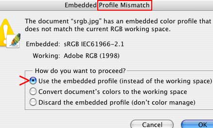
Embedded Profile Mismatch warning tells us the image's embedded profile does not match our Working Space, and it is asking us for instructions -- the correct move here is always "Use the Embedded Profile" or "Convert document's colors to the working space."
MISSING PROFILE
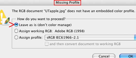
Missing Profile warning is tells us the file we are opening does not have an embedded profile -- if we "Leave as is (don't color manage)" Photoshop will Apply-Assign-Assume its Working profile.
The correct move here is always "Assign Profile" and see how selecting various profiles like sRGB, AppleRGB, AdobeRGB affects the color -- OK the profile that best appears on your Good Screen.
For more information see my ASSIGN Vs CONVERT to Profile tutorial.
If you are setting different Color Settings here — or thinking about trying to turn color management off by ignoring these warnings scenarios — please see my Turn ColorManagement ON & Honor My Embedded Profile, Please! white paper.
|
| 3) Setup Monitors-Displays control panel: |
|
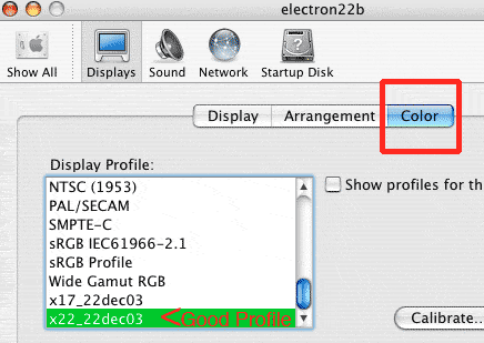
Apple OSX sets its default monitor profile in System Preferences> Displays> Color (the good monitor profile should be highlighted here).
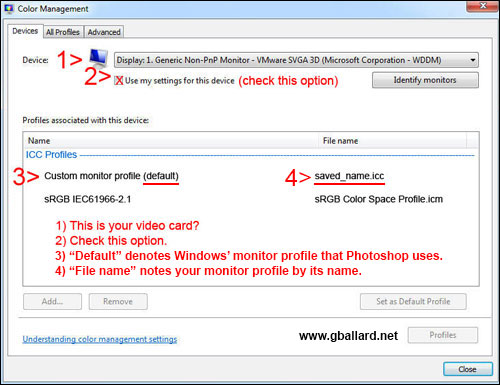
Windows 8, 7 Windows Vista, I am pretty sure, sets up its Default monitor profile in Color Management> Devices as indicated in #3 by its "(default)" notation:
|
| 4) Setup Apple ColorSync control panel: |
|
My Adobe workflows don't use ColorSync so I have removed this information.
For more info:
See my: ColorSync: A Mere Color Management System.
|
| 5) Setup Epson Print Utility: |
| Trying to stay on top of this moving target is a challenge since the geniuses have changed both terminology and user interface with each new Operating System since System 9.2 when I posted this page.
See my Creative Suite 5 CS5 PS12 PHOTOSHOP PRINTING WORKFLOW, including a great deal of expert tips and troubleshooting advice, also:
Archive:
Photoshop CS3 Printing instructions
Photoshop CS2 Printing instructions
Photoshop CS1 Printing instructions
For Macintosh Operating System 9 instructions.
|
6) Get a Good Printer Profile
for Specific Printer/Paper/Ink: |
|
If we have a Good Screen, a "calibrated monitor," confirmed the Epson Settings -- and the print still doesn't match the screen -- the likely Culprit is the profile we are targeting in the printer utility Print Space.
Some OEM (canned) Epson profiles seem to be better than others, but after we've ruled out everything else, we may need to hire someone like chromix.com to build a Custom profile (about $100 a profile).
A canned (OEM) Epson profile is generally only "good" for ONE specific printer model, specific ink set, and specific paper combination -- and even then -- OEM profiles, and profiles bought "off the shelf," will likely only be "good enough" (if they are even that good).
For the profile to be accurate, we need to have the profile made from our own printer targets using our own settings...the shinier (more glossy) the paper surface, it seems the greater the need for custom printer/paper/ink profiles.
••• Any use of non-Epson paper or ink will likely REQUIRE a custom profile for professional true-color results.
|
| DOWNLOAD a Good Reference File: |
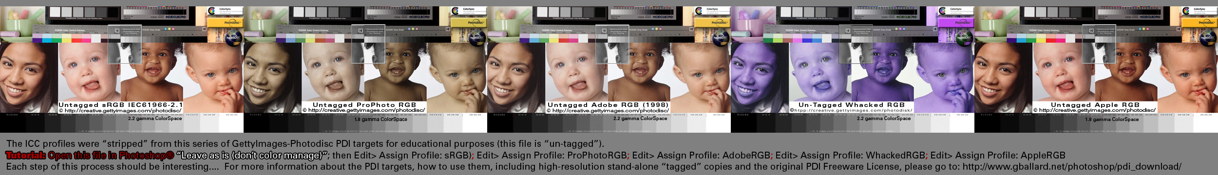
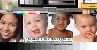
| My favorite high-resolution color reference images are the Photodisc® images with the three baby faces, young girl, and gray wedges:
DOWNLOAD ALL THE PDI high-resolution reference images -- now with ProPhoto and Whacked RGB targets!
|
Simple Tests
to rule out a monitor profile: |
|
If you suspect your monitor profile is bad or you want to rule it out, please see my PHOTOS ONLY LOOK BAD IN PHOTOSHOP white paper.
|
| Known Printing Bugs: |
|
Photoshop + Epson + OS X 10.7 10.6 10.510.4.6 10.4.7 10.4.8 10.4.9 has known printing problems over the years, including:
White papers, fixes, solutions to this Mac printing BUG:
- Official Adobe TechNote "Images printed to an Epson Stylus printer are too dark or have a magenta or green color cast".
- Andrew Rodney The Digital Dog wrote: "If you have MORE than one printer, especially an Epson, select the Epson you wish to print to as the default printer. The red banding should go away."
- I fixed this in my own workflow by printing out of Photoshop 8 CS1, or a Colorburst RIP.
- Epson told me in writing that the Windows computers do not have this bug.
MAC BUG NOTE: Red posterization in skin tones fix solution, plus magenta or green color cast, plus dark prints are known problems on the Mac OS X OSX.
- Posterized posterization in reds red skintones skin tones.
- Prints dark darker or lighter than monitor.
- Magenta cast green cast (this may or not be related to the bug, but has generally been associated to double management, managing the Source> Printer conversion).
|
| Conclusion: |
|
With a Good File (an accurate, color–managed, tagged file that renders accurately on our Good Screens):
We should see "Our Color" on all accurately-profiled proofing devices (including other monitors and printer output).
If other monitors and printers are rendering a color shift -- then -- those devices have a weak link somewhere within their local Color Management Chain.
In other words:
If one has a Good Screen -- and the target device is rendering uncharacteristic errors for that device -- one needs to fix the target device profile or CM settings -- NOT second guess the Good Screen.
This "Photoshop Manages Colors" & "Color Mode: Off (No Color Management)" workflow allows me to troubleshoot the CM Chain on a "switch level" and theorize my work flow in a straight line -- Photoshop Source Space> Target ICC Color Space.
|
| •••Photoshop Resource Links: |
Please read the www.gballard.net site USER AGREEMENT, and site DISCLAIMER for legal issues regarding your use of the www.gballard.net site.
G. Ballard, www.gballard.net, receives no compensation from, and is not affiliated with Adobe Systems, Inc., or Bruce Fraser or his associates or their many commercial enterprises.
|
Terms of Use • Privacy Statement • Site Map
Home • About Us • Mission Statement • Press Kit • Contact Us |