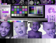
PhotoDisc GettyImages Test Image
DOWNLOAD PDI Color Calibration Target Photos
Faces from PhotoDisc Series #16 "Everyday People" photographed by Barbara Penoyar.
by Gary Ballard, Multi-Media Photojournalist, San Diego, USA
I've found several free professional digital reference images and "how to" articles on the Web, but believe this famous PhotoDisc® Getty Images target with young girl, three baby faces and neutral grey ramp, are the best reference image test files available to visually evaluate and troubleshoot digital color on the monitor, Internet and printed media under Adobe® CS6 color Mac® OSX and Windows® XP Vista Windows 7 8 operating systems.
This expert Photoshop layout is extremely useful for quickly evaluating monitor profiles in Adobe® Photoshop®, including verifying printing profiles, color management settings in apps, Web browsers and desktop publishing work flows — the PhotoDisc Image (PDI) has easily become my creative studio's standard reference image.
SKIP RIGHT TO:
DOWNLOADS (PDI color management test files)
TIPS & THEORY | SOURCE> MONITOR | SOURCE> PRINTER
|
Can you imagine opening your pictures on your computer and seeing how they will print before you actually print them?
This is what a couple simple color management steps and good profiles will do for you.
|
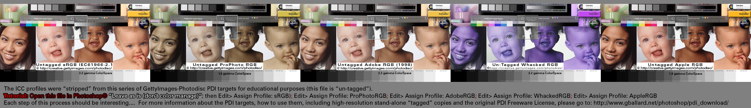
My best online COLOR MANAGEMENT TUTORIAL sets up these five PhotoDisc reference photos on a brilliant Web tutorial and explains the nuts and bolts of embedding, stripping and targeting ICC profiles while effectively demonstrating these top RGB color profiles in action — why sRGB is the ONLY profile you should be using on the Web.
See my BASIC PHOTOSHOP COLOR MANAGEMENT THEORY for more detailed information covering easy-to-understand concepts about how to use the PDI color targets to test and rule out various color management system (CMS) settings and about HOW TO MAKE PRINTS MATCH MONITOR in professional desktop publishing and multimedia production environments.
DARK PRINTS — One of the most common complaints is "my prints are too dark" and most people recommend "your monitor is too bright (turn down your display's brightness)." Well, I like a brighter monitor (luminance 120 to 140 cd/m2) and setting brightness below 100 cd/m2 luminance appears unappealing to my eyes.
- One known Epson bug that causes dark prints using PHOTOSHOP MANAGES COLORS, COLOR MODE OFF (No Color Management) has to do with checking "16 bit output" in the print driver....
While brightness is certainly one area to look at, I would think a monitor would have to be extremely bright for that to be the main culprit — more likely a monitor problem rests in your source file(s), it actually is on the dark side (or your settings or profiles are off).
OUT OF GAMUT COLORS — Another common complaint is "some colors in my prints look dull or changed compared to my monitor." Source images typically contain "out of gamut" colors or contrasty characteristics that a monitor or printer cannot possibly reproduce 100 percent... (or your settings or profiles are off).
These PDI reference images greatly reduce these two common variables because they have been professionally optimized for correct brightness, contrast and minimized gamut issues.
IF YOUR PRINTER IS NOT PRINTING YOUR DIGITAL COLOR CORRECTLY, AND YOU WANT TO TEST IF IT IS YOUR FAULT OR THEIRS:
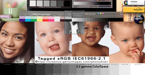
Include a copy of the Tagged sRGB.jpg image in the print order to check if they are printing sRGB correctly. If it does not come back printed proper, then I know the printer has a problem. If it is printed proper — but my Photoshop monitor looks off — then I know I have a bad monitor profile to troubleshoot.
My small local neighborhood photo printer consistantly delivers excellent printed color from my sRGB images — so should Costco, Walmart, Walgreens, Target, Snapfish, SmugMug, Shutterfly, Mpix, AdoramaPix, and any of the best online photo services (if their workflow is good).
Just be sure to Convert your images to sRGB (if they are not already in sRGB) — and if you want YOUR color — instruct your printer to "turn off all auto color settings in their software, and just print the photos as is with no adjustments."
|
| KNOWN GOOD FILES
PDI Targets are "known good files" and they should never ever be altered or edited to compensate for a bad monitor profile, bad printer profile or bad work flow.
Always use only my original embedded profile - do not Convert a PDI image to other profiles (it sort of defeats the purpose of using a known good Photoshop test image and adds elements of confusion because the correct profile is imprinted on the image).
Adobe color management policies offer a couple ways to screw up the Source Profile, so here's an important tip about how to verify what Source Profile Photoshop is using. Always "use the embedded profile" (don't Convert or Assign profile) when opening the PDI images in Photoshop or any other application.
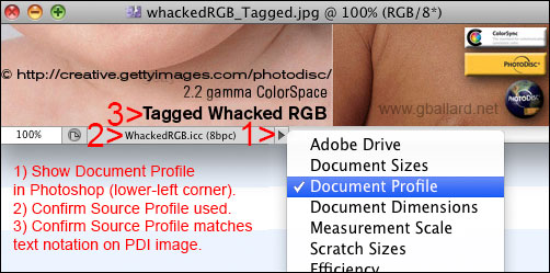
You want Photoshop's "Document Profile" (2) to match the profile imprinted on image (3):
To be absolutely clear on this Known Good File concept:
If you are using my recommended Source-to-Print profile workflow such as Photoshop Manages Colors - Color Mode: Off (No Color Management) -- you should not have to make any adjustments in your print driver to match the print to your monitor (and vice versa).
In other words, when you get your ICC profiles and settings nailed down -- the PDI images will print correctly and as effortlessly as Photoshop displays them correctly on your monitor.
|
These PDI color calibration images were carefully designed by experts to EXPOSE bad profiles and BROKEN workflows by providing you with the tools and basic theory to conceptualize, configure and troubleshoot THE COLOR MANAGEMENT CHAIN with good professional-quality reference images.
Use these images to visually evaluate monitor and printer profiles and troubleshoot color management settings by opening one of the PDI Targets in Photoshop and printing it to compare the two "proofs" side by side (monitor and print).
Opening a known good photograph (like these PDI targets) in Photoshop allows me to instantly evaluate a monitor — and compare Photoshop's monitor "proof" alongside its printed "proof" to help me see where the problem is occurring.
Once we understand these three core statements, the Great Color-Management Mystery unravels pretty fast:
- 1) In Photoshop (and color-managed applications), the Source Image profile is independent of the Monitor and Print profiles.
2) The monitor can PROOF (display) a source image correctly regardless of how right or wrong the printer is set up, and
3) The printer can PROOF (print) a source image correctly regardless of how right or wrong the monitor is set up.
The PDI Source Image contains "known good color" free and clear — Photoshop's Color Management System (CMS) reads PDI's embedded ICC profile and CONVERTS (or maps or corrects or adjusts) its colors to the target profile space (monitor or printer) — if the target profile is inaccurate, or the Color Management Chain is broken, the "proof" will appear with incorrect colors.
|
"CALIBRATION TARGETS"
No Color Management & Color Management Off |
| I think the industry's loose usage of "No Color Management" terminology is confusing at best — but when it comes to printing real "Calibration Targets" — we really do want to turn Color Management Off to send our document 'numbers' straight through to the printer unaltered.
By "Calibration Target" I specifically mean the un-tagged reference images that come with your profiling package. These Calibration Targets typically contain a chart of various color swatches and density patches as seen below.
I do NOT mean the tagged PDI reference targets that are designed to use embedded source ICC profiles and be Converted to the monitor and print profiles for 'accurate' proofing in color-managed workflows.
Here is a good example of a commercial Calibration Target by Datacolor, a global leader in color management solutions and color communication technology:
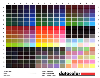
Target courtesy of Datacolor.
These types of un-tagged targets usually need to be sent "straight through" to the printer unaltered with No Color Management whatsoever — unlike the PDI targets that are designed to always use embedded source ICC profiles and be Converted to the monitor and print profiles for accurate proofing in color-managed workflows.
How to print Calibration Targets in Photoshop using Color Management Off or No Color Management settings?
First, if you are trying to print images (other than "Calibration Targets") from Adobe Photoshop using "No Color Management" — you may be missing my point — I will advise you to always use or apply a Source Profile to your image and Convert to your Print Profile in your printer settings.
However, if you are printing "Calibration Targets" and need to circumvent color management, here are how to instructions from adobe.com:
Photoshop Help / No Color Management option missing | Printing | Photoshop CS5: The option for No Color Management is no longer listed in the Color Handling pop-up menu in the Photoshop CS5 Print dialog box. Use the Adobe Color Printer Utility application to print your targets without color management applied (download Adobe Color Printer Utility from the Photoshop Help Adobe link).
|
| Source Profile > MONITOR Profile
The Color Management System CMS reads the embedded Source Profile and CONVERTS (or transforms or remaps) the document colors to MonitorRGB (the custom 'calibrated' monitor profile) and PROOFs (or paints in light) the color accurately on the display monitor.
The monitor can PROOF (display) the source file faithfully regardless of how right or wrong the printer is set up — the Color Management System, Photoshop, ONLY uses the monitor profile for one thing: To PROOF a source file on the monitor (the monitor profile has zero to do with how the file prints).
If a color-managed application is displaying a Tagged PDI image wrong, it is either applying the wrong Source Profile or it has a bad Monitor Profile enabled (or some software or hardware design or compatibility bug).
|
| WARNING: Source Profile > sRGB Profile
As a devotee of Apple/Adobe/Firefox's "full" approach to color management (Source> Monitor) — I am disappointed by Microsoft's "half" approach (Source> sRGB) at least in some Windows Web browsers.
 My tests (late 2012) included so-called "color-managed" Windows versions of Chrome, Internet Explorer IE, and Safari. My tests (late 2012) included so-called "color-managed" Windows versions of Chrome, Internet Explorer IE, and Safari.
My observations concluded that Windows only does "half" or limited color management — meaning some so-called color managed Web browsers (and applications) on Windows only Convert Tagged elements to sRGB (Source> sRGB).*
- *Firefox configured using its Value 1 is an exception: Like Photoshop, Firefox Assigns a default Profile (sRGB) to all untagged elements, honors embedded profiles in tagged elements, and Converts them to the default Monitor Profile (Source> Monitor).
If you want to test this claim, just open the Tagged WhackedRGB PDI reference image in Photoshop (Use the Embedded Profile), then drag its .jpg file icon into the open windows (or URL address bar) of two color-managed Windows Web browsers (Firefox and another one) to open it in both browsers — and compare Photoshop and two browser windows side by side (inspect closely zoomed in at Actual Pixels, 100%). Aside from obvious color balance, the two darkest black boxes in the bottom left corner of the PDI is a good place to check for a mismatch.
- TIPS: 1) If the WhackedRGB image displays super blue, your application is not color managed or it is ignoring the embedded profile. 2) If it opens with a moderate red oversaturation, you are likely using a wide-gamut monitor and your application is only Converting to sRGB.
If you are using a custom monitor profile, Photoshop and Firefox (Value1) should exactly "MATCH" the PDI image through Source> Monitor Conversion.
A "half" color-managed Windows browser will likely look at least slightly different than Photoshop and Firefox because it is using a Source> sRGB Conversion (not Source> Monitor) — the difference between Photoshop/Firefox and the other color-managed Web browsers will be the difference between sRGB and your monitor profile.
|
Most useful PDI Target "Whacked RGB":
In my opinion, Whacked RGB color space provides students and professional work flow troubleshooters alike with the best example of a color management test file because Whacked RGB will most clearly show the problem if its embedded profile is ignored, stripped, improperly printed or displayed on a monitor.
For best results, view this example in color-managed Web browser, or a recent version of Mozilla Firefox. Move cursor on-off this PDI example to rollover my examples:
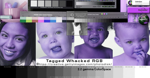
Tagged WhackedRGB.icc
If the rollovers look exactly the same (blue) your Web browser is not color managed.
Both Tagged and Untagged rollover files are identical except the top Tagged image has an embedded ICC profile, and its Untagged rollover mate has had its profile stripped for this tutorial.
FULLY COLOR-MANAGED web browsers (Source> Monitor RGB) will display the Tagged top image properly (like Photoshop) because the Color Management System is reading its embedded profile and Converting (or correcting) its color to the monitor profile for theoretical "true color" display.
"HALF" MANAGED web browsers (Source> sRGB) will display the Tagged top image okay on standard RGB monitors. Wide-gamut monitors will likely display the Tagged top image over saturated in the reds.
COLOR-MANAGED web browsers will display the Untagged rollover whacked image with a bizarre blue color cast because its ICC profile has been stripped from the image and your Web browser (or app) is only sending its RGB numbers straight to the monitor unaltered.
UN-MANAGED web browsers will display both images identically (with the crazy blue color cast) because the embedded profile is being ignored and the browser (or app) is only sending its RGB numbers straight to the monitor unaltered.
The full-resolution Whacked RGB image and WhackedRGB.icc profile may be downloaded below for further testing in Photoshop.
|
| Source Profile > PRINT Profile
The Color Management System CMS reads the embedded Source Profile and CONVERTS (or transforms or remaps) the document colors to the Target Profile (the custom 'calibrated' printer profile) — a SPECIFIC Printer/Paper/Ink ICC Profile or PressCMYK — and PROOFs (or paints in ink) the color accurately on the printed paper.
The printer can PROOF (print) the source file faithfully regardless of how right or wrong the monitor is set up — the Color Management System, Photoshop, ONLY uses the printer (target) profile Print Space for one thing: To PROOF a source file on the paper (the printer profile Print Space has zero to do with how the file looks on the monitor).
If a color-managed application is printing a Tagged PDI image wrong, it is Converting to a bad Printer Profile (assuming the correct Source Profile has been applied and the print settings are correct).
|
What seems to confuse most people about the "how-to-make-the-print-match-the-monitor" process is when the image looks good on their monitor, but their print doesn't match.
Remember the PDI photos contain theoretical "true color" — the monitor profile has zero to do with how the image prints — so the problem then points to the printer profile or printer settings.
I set up a basic PHOTOSHOP PRINTING TUTORIAL outlining a proven "Photoshop Manages Colors" work flow, including extensive troubleshooting tips & techniques.
If the PDI color is displaying correctly in Photoshop, but your other image(s) is not displaying so good, the problem is likely a Source Profile issue (the wrong profile being applied to your image), or it actually has the problems Photoshop is showing you.
It is pretty common for even experienced users to create over-saturated, out-of-gamut colors or subtle tones in their RGB images that don't translate well to certain inksets or papers (substrates). Balancing digital color for professional looking results is a craft and an art, and it requires some experience, trial and error on your part.
But again, the PDI images have been professionally optimized to exclude those types of issues — trust Photoshop and the PDI targets to show you what's really going on with your setup.
THE PROPER TOOLS:
Photoshop "Soft Proofing" and "Gamut Warning":
The dreaded out-of-gamut-color phenomenon can account for a great deal of a monitor-to-print mismatch:
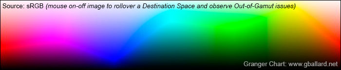
The above Granger Chart rollover dramatically illustrates the technical and artistic challenges involved with 'matching' a monitor preview to a print — in this example — the brilliant RGB source color gamut is compared in a rollover after converting it to a common American CMYK print Space (US Web Uncoated v2).
As the rollover Soft Proof demonstrates, the smaller CMYK print Space (paper and ink technology) simply is not physically capable of reproducing the brilliant color saturation, gamut and dynamic range of the source or monitor RGB spaces used in this rainbow of color spectrum example.
My best advice is to train your eye to trust the quality hardware-calibrated Photoshop monitor, and learn how to interpret what you see with your own eyes — configuring a couple settings on your printer should be the easy part.
|
PDI DOWNLOADS
print resolution:
|
PDI_Target_WhackedRGB.jpg
I recommend to BEGIN troubleshooting and testing color management work flows with the WhackedRGB reference image, color management test image.
The reason Whacked RGB is so useful here is unlike AppleRGB, AdobeRGB, sRGB, ProPhotoRGB, custom Monitor RGB — which some users may have trouble evaluating in certain environments — WhackedRGB will always appear with a distinct blue-purple color cast if it is not opened correctly and properly converted to the monitor or print space.
IMPORTANT: If your work flow is proper, Whacked RGB will display and print visually identical to the other four tagged PDI targets.
DOWNLOAD PDI Target(WhackedRGB)ONLY.zip (4MB) for Windows PC and Mac OS-X. Includes the "WhackedRGB.icc" profile for loading into Windows, ColorSync and Adobe work flows.
+++++++
Expert Tips & Instructions about how to use the PDI reference images in Photoshop:
You always want to open a tagged Getty-Photodisc image (PDI) "using its embedded profile":
- Do not Convert its tagged/embedded ICC Profile to a different Profile
- Do not Assign or Assume another Profile
- Do not alter these PDI images in any way
- Do not save over them
Some Adobe color-management policy settings will mysteriously Assign or Assume (apply) the wrong profile and/or Convert to a different profile — so be positive you are using my original document profile imprinted on each image, and have not inadvertently ignored or Converted or Assigned or Assumed the wrong source profile behind the scenes.
OPEN THE PDI IMAGE CORRECTLY IN ADOBE PHOTOSHOP:
"Use the embedded profile (instead of the working space)" is always the correct first move when opening documents with embedded ICC color profiles that do not match Photoshop's working profile:
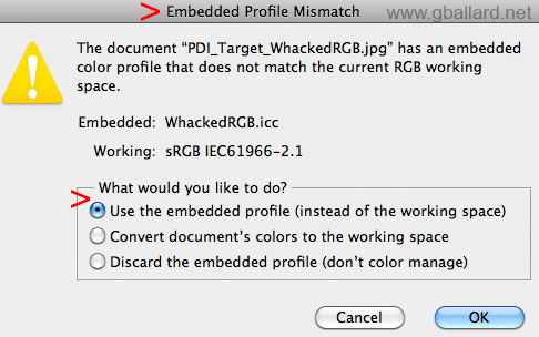
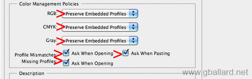
If you do not hit the Embedded Profile Mismatch warning (above) — or the Tagged Whacked RGB image is not opening proper in the embedded Whacked RGB color space — go to Photoshop Edit>Color Settings> Color Management Policies and set all three options to Preserve Embedded Profiles, and check all three Profile check boxes (as pictured below):
These recommended policy settings will now trigger the "Embedded Profile Mismatch" warning dialog above when you open the WhackedRGB.jpg — and the correct move (again) is to "Use the embedded profile...".
HOW TO CONFIRM PHOTOSHOP OPENED THE PDI IMAGE CORRECTLY:
At this point — if opened correctly — Photoshop's "Document Profile" (2) below should match the profile imprinted on the image (3). Click on the triangle bullet (1) to select show Document Profile, and verify they match up:
Further, if Tagged Whacked RGB is opened as suggested, in Photoshop, View> Proof Setup: "Monitor RGB" should display the heavy blue tone in the above thumbnail (toggle Monitor RGB off to return to normal preview, that's Command+Y on Mac, Control+Y on Windows to enter/exit/toggle proof colors mode).
Then print it... the print should be a reasonable match your monitor, if your settings are good, and depending how accurate your monitor and print profiles are.
If you do not have Adobe Photoshop to test:
Simply 1) download the .zip, 2) extract the WhackedRGB.jpg file, and 3) drag its icon into an open Web browser window (or its URL address bar) -- and observe closely:
- fully color managed Web browsers (Source>MonitorRGB) will display Tagged WhackedRGB properly and "match" Photoshop (the Source RGB 'numbers', the colors, are being Converted to the monitor profile for a theoretical true-color display),
- unmanaged Web browsers will display the WhackedRGB image with a bizarre blue color cast (the Source RGB 'numbers' are being sent straight through to the monitor with no color adjustment),
- half color managed Web browsers (Source> sRGB) will look pretty good on an sRGB-compliant monitor, but will be slightly different than Photoshop -- wide-gamut monitors will more than likely display PDI images with a strong red saturation.
Also apply the same theories in your other applications like Apple's Preview.app, Final Cut Pro, Aperture, Microsoft Word, and Adobe apps like InDesign, Illustrator, Premier, Bridge, and Lightroom. Windows-based apps, too.
|
DOWNLOAD ALL SIX high-resolution PDI targets in one:
Below download link INCLUDES ALL SIX HIGH-RESOLUTION 300 ppi-dpi, 3,000x2,287 pixel dimension, 7.6x10-inch, 20-megabyte print files in sRGB, Whacked RGB, Adobe RGB (1998), Apple RGB, ProPhoto RGB, eci RGB v2 (v4 ICC profile):
- DOWNLOAD all PDI TargetFolder.zip
(22MB) for Windows & Mac OSX.
ALSO INCLUDES:
WhackedRGB.icc and ProPhoto.icm ICC profiles.
Low resolution 72ppi Tagged & Untagged Web tutorial versions contained in the iPhotoTESTfolder, original Photodisc .jpg and Freeware license.
If you just want a good professional reference file and don't need to know all this technical stuff, I will recommend you download the "all PDI TargetFolder.zip" above and just use the high-resolution sRGB version to test your monitors and printers.
|
PDI_Target_AdobeRGB.jpg only:
For aRGB users, this 300 ppi high-resolution PDI_Target_AdobeRGB.jpg is an excellent test file for its various skin tones and neutral gray desaturated areas, embedded ICC Profile and popular device-independent Color Space.
- DOWNLOAD PDI Target(AdobeRGB)ONLY.zip (5MB) for PC and Mac OSX.
DOWNLOAD PDI Target(AdobeRGB)ONLY.sit (5MB) for Mac (Stuffit Expander required).
|
 PDI_Target_PDF PDI_Target_PDF
I created these Acrobat PDF test files using my ten low-resolution PDI RGB targets (five tagged/untagged pairs) — open them in Adobe Acrobat to observe how .pdf documents react to color spaces and embedded ICC profiles. You should be able to see: 1) Acrobat honors embedded profiles and corrects their source colors to the monitor profile just like Photoshop (Source> Monitor RGB), and 2) Acrobat passes through untagged RGB (unmanaged colors) unaltered based on its default Working Space just like Photoshop.
- PHOTOSHOP PDF:
DOWNLOAD PDI .pdf (2.3MB) Note: This download may expose a color-management bug that involves either the Photoshop PDF format, and/or Acrobat's Print Production> Convert Colors routine — it is OUTLINED HERE. This PDF was packaged by opening the PDI .jpg documents in Photoshop, doing ten File> Save As Photoshop PDF routines, then opening one of the PDFs in Acrobat Pro, and dragging the remaining nine PDFs into its Pages Panel — it appears to display flawlessly in Acrobat until someone trys to Convert Colors in Acrobat.
INDESIGN> EXPORT PDF> (Print):
I packaged this DOWNLOAD PDI .PDF (3MB)* out of Adobe InDesign as a test after I discovered the Adobe bug using my above Photoshop PDF file — this new PDF appears to Convert Colors properly in Acrobat. I packaged this PDF in CS6 Adobe InDesign using my original PDI Photoshop jpgs and then Exported to PDF.
*However, this InDesign> Export PDF> (Print) workflow appears to also have a bug — it strips one of my four embedded profiles — my workflow is OUTLINED IN THIS ACROBAT COLOR MANAGEMENT TUTORIAL.
INDESIGN> EXPORT PDF:
PDF/X-4 workflow coming soon...
|
iPHOTO Tutorial Images
low resolution: |
iPhotoTESTfolder contains a low-resolution 72 ppi collection of ten files of one image in various common Color Spaces, in tagged/untagged states, designed to PROOF how the different profiles, color spaces, 2.2 and 1.8 MONITOR GAMMAS and COLOR GAMUTS react in various computer programs and picture viewers.
Moving this series of ten .jpg photos into picture viewers like Bridge, iPhoto, Aperture, Windows Picture Managers, Windows Explorer, Lightroom, Microsoft Word, Finder, Apple's Preview.app should be enlightening for how the different RGB color spaces, gammas and color gamuts react in the various operating systems and apps.
iPhotoTESTfolder files are included with the above "DOWNLOAD all" folders.
iPHOTO Test Files also reference my Assign Versus Convert Photoshop Tutorial. Now with Pro Photo and Whacked RGB:
- DOWNLOAD iPhotoTESTfolder.zip
(14MB) for PC and Mac OS-X.
|
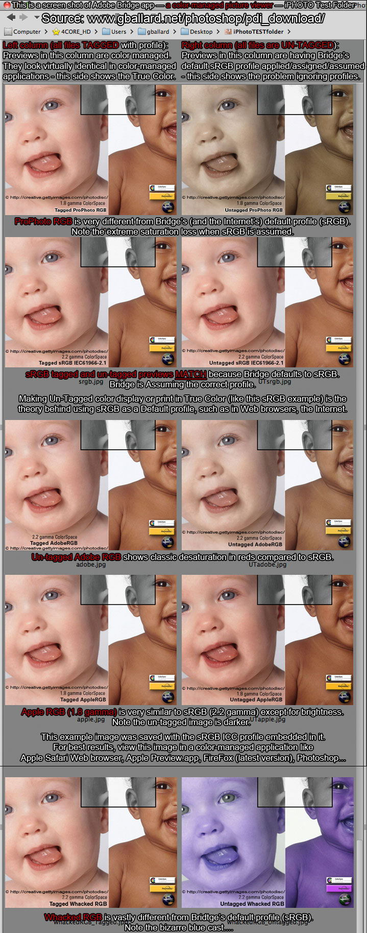
Here are my iPhoto Tutorial images set up in a color-managed picture viewer (Adobe Bridge screen capture):
NOTE:
- TAGGED (left column): All the tagged files appear identical in the left column (Bridge read the embedded profile and correctly Converted them to Monitor RGB for True Color display).
- UNTAGGED (right column): The un-tagged set in the right column all had Bridge's default profile (sRGB) automatically applied/assumed/assigned, so they all displayed incorrectly except for sRGB (sRGB is Bridge's default profile).
Does Bridge display sRGB previews?
How do color-managed picture viewers work?
It was suggested on the Adobe color management forum that Bridge Converts original Tagged source documents to sRGB (Source>sRGB) and saves preview images in its cache — then Bridge uses its sRGB preview images and Converts them to the monitor profile for display (sRGB>MonitorRGB). This appeared to be observable, but I am not 100-percent positive this is how Bridge works and was not curious enough to test it myself.
A good point to make here is if Photoshop is displaying wide-gamut color spaces (ProPhotoRGB, AdobeRGB) a bit differently differently than your color-managed picture viewer — Bridge, Lightroom, iPhoto, Aperture — trace the color-management chain to see what's going on, if your viewer is performing a true Source> Monitor Profile conversion, or if it is using sRGB preview images from its cache...
If you are still trying to understand how ICC Profiles work — Save the above image to your Desktop — Open it in Photoshop (use the embedded profile: sRGB) — then Edit> Assign Profile: ProPhoto RGB — observe the color chaos (all the photos go super saturated in the reds EXCEPT for the Un-Tagged ProPhoto RGB, it snaps back to True Color).
If you want an even more bizarre example of how this works — Save the above image to your Desktop — Open it in Photoshop (use the embedded profile: sRGB) — then Edit> Assign Profile: Wacked RGB.
- To have "Whacked RGB" available under Photoshop's Assign Profile, you will likely need to have already installed the "WhackedRGB.icc" profile from one of my PDI downloads.
If you are intrigued by all this, please check out my Assign Versus Convert Photoshop Tutorial for profile enlightenment.
Here is a great on-line demonstration of ICC profiles in action.
PhotoDisc production CREDITS:
Art Direction: Gary Hawkey
Photographer: Duncan Smith
Retouching: Jeff Johnston, Peter Constable
Styling: Ann VanderCreek
The hand: Danielle Wares
Special thanks: Ken Applebaum, Michael Collette, Anson Hosley, Eckhard
Huebner, the International Color Consortium
For additional info:
ColorSync www.apple.com | www.color.org | PhotoDisc www.gettyimages.com
Note:
PDI_Target images are owned and Copyrighted by PhotoDisc® gettyimages.com.
PDI_Target DOWNLOAD files have been altered by G. BALLARD for this tutorial, in accordance with PhotoDisc's licensing terms. The original unaltered Photodisc JPEG and Freeware License are included in all DOWNLOADS.
Adobe and Photoshop are either registered trademarks or trademarks of Adobe Systems Incorporated in the United States and/or other countries. PDI reference images © Photodisc® Getty Images, ColorSync® is a registered trademark of Apple Computers, Inc.
|
Terms of Use • Privacy Statement • Site Map
Home • About Us • Mission Statement • Press Kit • Contact Us |
|
|